| WORKSHOPS Links:
Painting Flowers - Mandy Southan
Colour Mixing - Mandy Southan
Decorative Effects - Leonard Thompson
Dyeing Devores - Caroline Munns
Silk Choker Necklace - Linda Graves
Wax Melting Pots - Jill Kennedy
Gutta Pro-liners - Isabella Whitworth
Javana Air Pen - Isabella Whitworth
Microwave Dyeing - Vera Dreyfuss
Painting Borders - Tessa Barnes
Ten Top Tips - Jill Kennedy
Transferring designs - Anon
Free-style landscapes - Marianne Nash
Painted Silk Poppy - Mandy Southan
Magic Lettering - Leonard Thompson
Painted Lilies - Mandy Southan
The Silk Road - Mandy Southan
Aspects of Design - Leonard Thompson
Selling your work - Ian Bowers
Japan: Textiles - Mandy Southan
|
|
SUCCESSFUL COLOUR MIXING - Mandy Southan
I have been teaching art for many years, and I have noticed that many people seem to have difficulties with colour mixing and in understanding how to use colour well.
The initial problem that every painter encounters is trying to decide which colours to buy from the huge ranges on offer, to enable them to mix the widest range of colours. Some opt to buy lots of ready mixed colours and just work with those. The trouble with this is that apart from the expense, paintings made with ready mixed colours tend to lack unity, harmony and subtlety. Pre - mixed colours are often rather crude and unsubtle and in relying on them, no real control or understanding of colour is gained by the artist.
Most people find working with colour difficult either because they have never been taught colour theory and mixing or if they have, they were taught the old 'primary' mixing system using three primary colours - red, yellow and blue to mix three 'secondary' colours - violet, green and orange. Despite the pioneering work of people such as Michael Wilcox, founder of 'The School of Colour' and author of 'Blue and Yellow Don't Make Green', the old primary system persists, causing frustration and confusion for painters in every field. Even some of the newest painting books still show the six - section colour wheel and instruct that 'red and blue make violet; yellow and blue make green; and red and yellow make orange'. They don't.
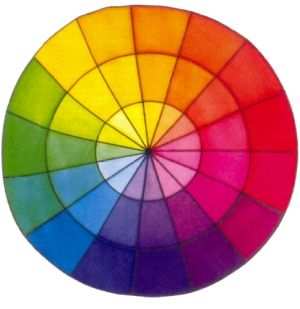
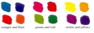
Above is a more accurate and helpful colour wheel based on what is sometimes called the 'Dual-Primary System' which is formed using six basic colours instead of three - a greeny blue and a violety blue; an orangey red and and violety red; a greeny yellow and an orangey yellow. When the colours are arranged in a circle or 'colour wheel' the complementary colours are found opposite each other - oranges and blues; greens and reds; violets and yellows. These complementary 'pairs' of colours are very important in painting and can be used to create many different effects. Tints of the colours can be made by adding water or diffusing medium to the colour (colours become paler towards the centre of the wheel). So why doesn't the old primary system work? It says you need a red, a blue and a yellow for mixing secondary colours. But which red, blue and yellow? There are so many to choose from and very different results are produced depending on which reds, yellows and blues you work with. For instance, a magenta red mixed with an ultramarine blue will produce a range of bright violets. But a bright scarlet red mixed with a bright turquoise blue will not make violets at all, only browns and greys! Ultramarine blue mixed with orangey yellow makes dull greens, whereas turquoise blue mixed with lemon yellow makes bright greens. Colour mixing can be very confusing and is often a very hit and miss affair!
Yellows and Reds can be mixed
together to make oranges
Yellows and Blues can mixed
together to make greens
Blues and Reds can be mixed together to make violets |
|
The first step to good color mixing is having the right colours to begin with .Three primaries are just not enough. You have to have six basic colours, as bright and pure as you can get. With the right six you can mix virtually any colour you could possibly want:
two different types of yellow, two different types of blue and two different types of red
 1 orangey yellow (golden) 1 orangey yellow (golden)
2 greeny yellow (lemon)
3 greeny blue (cyan)
4 violety blue (ultramarine)
5 violety red (magenta)
6 orangey red (vermillion)
Each colour has a bias towards one end of the spectrum or the other. An ultramarine blue, for instance, is a violety blue - it tends towards the violet end of the spectrum. A turquoise blue is a greeny blue and is closer to green in the spectrum. An ultramarine blue has a bias towards violet and is therefore good for mixing violets, whereas a turquoise blue has a tendency towards green and is therefore better for mixing bright greens. It's the same with the reds. Each red has a bias either towards orange or violet. Likewise, every yellow is either a greeny yellow or an orangey yellow.
When you mix two colours together you don't get a 'new' colour, you get the colour that is predominantly carried in each of them. Colours absorb each other - sort of cancel each other out - and what is left is the colour that was common to both. If there is little or no common colour in each, you get dark browns, greys and ultimately black. All colours get greyer as you mix them (they are heading towards black) so you
need to mix as few colours as possible to get the colour you want.
Some people find it very difficult initially to distinguish between each of the two types of red, yellow and blue. They can see that they are different but cannot see the 'hidden' colour in each. Blues seem to cause most problems, perhaps because the human eye is least sensitive to blue and most sensitive to red. I think that the more you work with colour, the easier it becomes to differentiate the colour bias in each and analyse the constituents of any colour you see and so be able to mix it confidently.
If you want to mute or darken a colour, don't use black which destroys the character of the colour - use the complementary colour, opposite it on the colour wheel. Complementary pairs are used to mix ranges of neutral colours - browns, greys and blacks. With practise, you will gain complete control of colour, being able to mix any colour you want immediately, without wasting paint or expensive dyes and making colour work for you.
If you would like details of tuition
please visit my web page by clicking here. |
|